Release date: January 28, 2014 (build 7.7.3045)
The CssOnly mode is now enabled by default.
All ASP.NET controls now include a built-in CSS theme. If you don't specify a custom theme using Theme property the default CSS theme will be used. This makes switching to the new version easier - in previous version it was necessary to include a CSS theme stylesheet and specify the theme name.
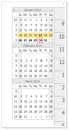
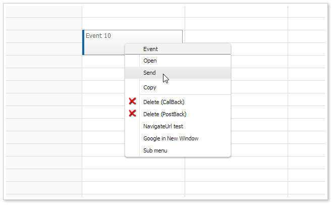
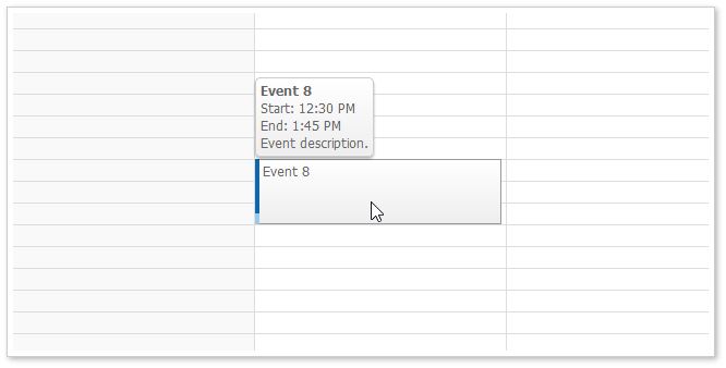
The date picker uses the navigator_default theme as it is based on the Navigator.
Daily/Weekly Event Calendar
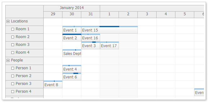
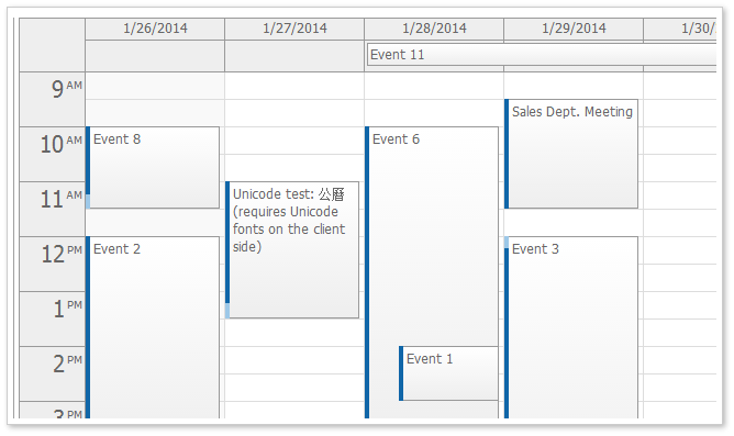
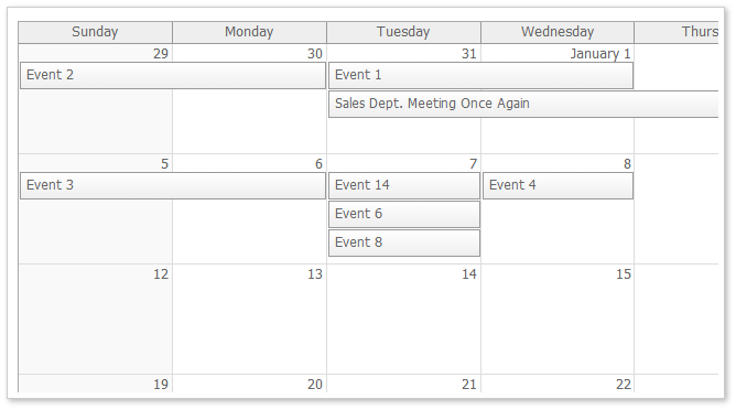
These themes are based on the traditional DayPilot look (in !CssOnly mode). You can use them as a starting point when switching to CssOnly mode.
The themes were created using the online theme designer and tweaked a bit (the duration bar border in calendar and scheduler was added manually).
Demo: http://www.daypilot.org/demo/Scheduler/ThemeTraditional.aspx
Designer: http://themes.daypilot.org/scheduler/theme/m3km5n
Demo: http://www.daypilot.org/demo/Calendar/ThemeTraditional.aspx
Designer: http://themes.daypilot.org/calendar/theme/japngi
Demo: http://www.daypilot.org/demo/Month/ThemeTraditional.aspx
Designer: http://themes.daypilot.org/month/theme/bn47e7
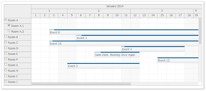
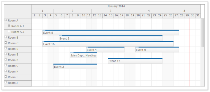
You can use CellWidthSpec="Auto" to adjust the cell width automatically so the full Scheduler width is used.
Behavior:
Demo: http://www.daypilot.org/demo/Scheduler/AutoCellWidth.aspx
In the previous version long events were difficult to read because the text was hidden.
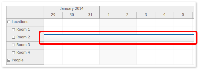
If the event start is not visible (long events than span several days) it displays a special floating div over the event that displays the event HTML.
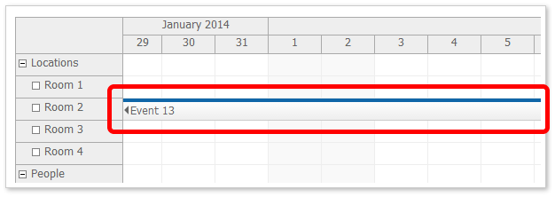
You can enable/disable it using FloatingEvents property. It is enabled by default.
In the previous version long header cells were difficult to read because the text/HTML was hidden.

If the header start or end is not visible (for long headers, especially month and year time header groups) it displays a special floating div over the event that displays the event HTML.

You can enable/disable it using FloatingTimeHeaders property. It is enabled by default.
Calendar, Month, and Scheduler controls now use MoveBy="Full" by default.
Scheduler
Calendar
Month
You can specify selection dimension properties in the CSS. This is helpful if the CSS is designed to work with different than default dimension. It will soon be added to the online theme designer as well.
This CSS value will override the value specified using the calendar object.
Event Height (.eventHeight property):
*_event_height { height: 25px; }Header Height (.headerHeight property):
*_header_height { height: 20px; }Replace the asterisk with the theme name.
All-Day Event Height (.eventHeight property):
*_alldayevent_height { height: 25px; }Header Height (.headerHeight property):
*_header_height { height: 20px; }Replace the asterisk with the theme name.
Event Height (.eventHeight property):
*_event_height { height: 25px; }Day Header Height (.headerHeight property):
*_header_height { height: 20px; }Replace the asterisk with the theme name.
The business cells are marked with a special CSS class.
*_cell_business
It is applied at the same level as *_cell so you would define the business cell style like this:
.scheduler_default_cell.scheduler_default_cell_business {
  background-color: #fff;
}
This class is not applied when you use .drawBlankCells = true and don't handle .onBeforeCellRender event (for performance reasons).
For the list of supported browsers please see the compatibility page.